
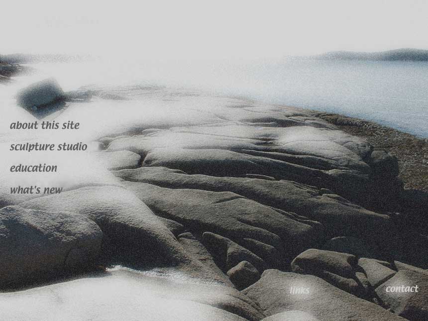

I am in the process to revamp my web-pages. These are just two examples I came up with. One is more misty and fades... the other is more bold. You'll be the judge to what direction I should take.
Tuesday, January 31
I need feedback
Subscribe to:
Post Comments (Atom)


10 comments:
Each image is visually appealing but conveys a different mood.
In my opinion the top one on the right is more surreal and in a way reminds me of a zen brush painting, but the words are not as clear to read. Whereas the one on the bottom left seems more vibrant, easier to read and the water is pleasing to the eyes.
Maybe you should give each a trial run to see which better reflects the mood you want your site to convey.
I'd go with misty..
not much in it ------like the one on the bottom but you could alternate as has been suggested !!
It makes more of a bold statement to me, an identity of modernity in sculpture.
Very helpful comments indeed. I will try to incorporate them in a third try ...
Thanks for the input everyone!
I'd suggest some Buddha pictures..
Zee, I like the black and white "misty" image. It has an ethereal quality I like. But, then, I'm not normal.
Incase you'd like my opinion :) I like the second bold image. It's striking and since you come across as someone who isn't afraid to speak his mind, that fits a little better. Just my two cents.
I like the color image. It seems to have an almost Dali quality with the sculpture. I also like the ocean in it.
I like the bold one, although both are intriguing. In fact, I want to see and touch that sculpted piece - how large is it? It's beautiful.
I like the BOLD one.It makes you look twice and gives you something to contimplate.It sotra seams like your that sculpture out there standing in the open taking in whats around you.
Go with the bold its more ecsentric
Post a Comment